Microsoft’s 7-point plan to fix Windows 11 makes macOS Tahoe look golden


Update, 11:10pm ET: Apple has updated its release notes again. The company now says macOS 26.3 doesn’t fix the window resizing bug. Instead, it’s once again listed as a “known issue.” Original post below.
Apple released macOS 26.3 to the public today, and the update fixes two design problems introduced by the Liquid Glass revamp in Tahoe: resizing windows and resizing columns in Finder.
Read More
macOS Tahoe app icons came under fire late last year with commenters describing them as “terrible” and “objectively bad.” In our poll, 9to5Mac readers had exceedingly mixed views.
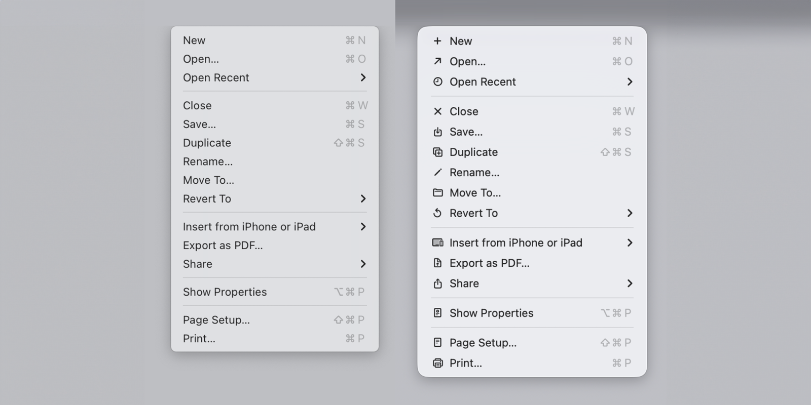
Software engineer Nikita Prokopov has now drawn attention to the icons used within menus and pointed out that they almost exactly mirror the approach which Apple’s Macintosh Human Interface Guidelines advised against back in 1992 …
Read More
Yesterday I highlighted macOS Tahoe’s aggressive behavior of putting nonconforming app icons inside an ugly gray box of shame. The change seems to affect the Mac user experience more than it impacts the app developer. It makes the actual icon 20% smaller and 80% harder to recognize.
A great thing about the Mac, though, is the ability to customize app icons. This can be a temporary solution. You just need to track down an app icon that works. Here’s how to swap out app icons on macOS Tahoe and avoid the gray box effect.
Read More